Housing issue: the design (30 photos) Kitchen in different color schemes
Table of contents
- 1 Color spectrum
- 2 selection Options
- 3 Psychological parameters choice of colors
-
4 Colors, lighting and area
- 4.1 From North to South
- 4.2 The selection panel depending on the size
- 5 Summing up
- 6 Photo Gallery
At some point, we are faced with a repair housing problem: the kitchen design. On the intricacies of selection of colors, shapes, furniture and finishes today in our article.
Color spectrum
So whether it is important or not a significant difference, you select the kitchen design in a lavender color or stop for a more classic version?
The unequivocal answer to this question is no. On the one hand, the choice of colors kitchen design - it is purely personal preference.
On the other hand - the color affects much from the visual perception of space (light colors will make the room more spacious, dark - more comfortable) to the emotional state of the person who will be in the room.
So choosing a color scheme, considering the design of green cuisine or classic finish "under the tree", it is necessary to consider not only the design, but also the psychological aspects.
selection Options
What must be taken into account, starting the selection panel?
Experts in the field of interior design are advised to consider the following options:
- room lighting;
- area and configuration;
- style;
- Headset combination with decorations and finishes;
- personal preferences.
Psychological parameters choice of colors
Kitchen Design
Consider such a "thin" dimension as psychological features of the color gamut of human exposure.
Kitchen - this room, clearly and inextricably linked with the process of eating. That is why psychologists are advised to often enough to pay attention to the repair option on the impact of food colors and finishes on the headset human appetite.
Especially important this moment is for those who want to control their weight.
Designers emit colors that stimulate appetite ( "appetizing color"), anorectic and neutral.
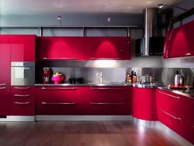
- For colors that stimulate appetite are shades that most people associate with ripe and fresh products. It is primarily the color "hot" end of the spectrum - yellow, orange, red.
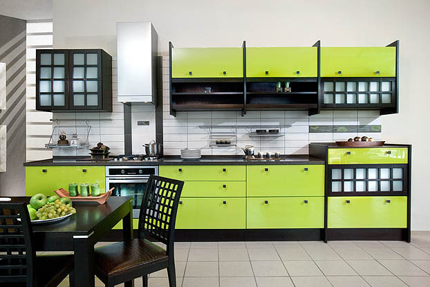
- These colors join bright green and light green. Design light green kitchen gives our subconscious a clear signal - the products are fresh, fresh from the garden.
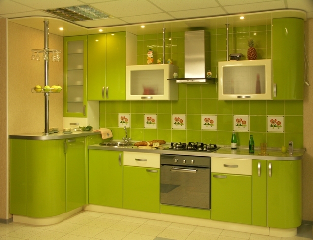
light green kitchen
- Furthermore, green products are strongly associated with the use and the high content of biologically active substances (remember the bulk of the advertising that promotes products for health and beauty, almost all of it is made in green color scheme).
- Therefore, the design of green food will also stimulate our appetite, because "green" means "useful"!
- What conclusion can be drawn from the above? If you aspire to control their own weight or occasionally sit on the diet - that the idea of kitchen design should be treated with caution, and do not use the color palette, stimulating appetite.
- Kitchen design in orange every time will "push" you eat another bite, even if this piece is absolutely not necessary for your body.
- But if you can not boast of a good appetite, or weight control issue is not relevant for you - feel free to use "tasty" colors.
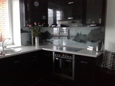
- For colors, reduces appetite, applies the "cold" part of the spectrum. Blue, blue, purple color in its pure form is rarely found among products because not causing culinary associations. This includes black and gray in monochrome kitchens thought of food will not arise a priori.
- Use color design solutions that reduce appetite, be very careful. On the one hand, for those who want to reduce the weight effect is obvious: there is no appetite - no extra weight. However, think about whether you need a kitchen in which the banal is not hungry? Maybe it's better to choose neutral colors and blue or blue colors to use, where they are more appropriate - for example, to finish the bathroom?
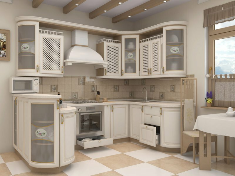
- The traditional neutral colors designers include, first of all, white. The white parts are able to "dilute" the color and reduce its impact.
- As much impact on the desire to snack more tightly will not have the color or design of the kitchen aubergine room, decorated in the colors of natural wood.
Colors, lighting and area
All of the above came to such a "subtle matter" as human psychology. However, taking into account the effect on appetite selection of design solutions is not limited to.
On the contrary, there are several aspects that are just as important when choosing a color scheme.
bright kitchen
From North to South
One such aspect is the lighting in the room where you plan to repair. The level of natural illumination which depends on the number and size of windows, their orientation and the presence of preventing the passage of light objects (close-alone buildings, trees outside the window) should be considered in mandatory.
Most often it is experiencing shortage of space with windows facing the north and north-west facing position. For such rooms decoration and furniture should be done in colors that reflect natural light.
This bright gamma: white, yellow, beige, green. The room in which the sun barely peeks can essentially "stretch" design yellow kitchen or use in the decoration of several white panels.
On the contrary, a kitchen on the south side covered pretty well. It is appropriate to be light-absorbing colors: purple, dark brown, burgundy.
Red kitchen
In a well-lit room may look appropriate, even such a bold design decision, as the design of the kitchen in red. Here is completely justified the use of mirrors and polished metal surfaces, the sun's rays will create for them a wonderful play of light.
Moreover, it should take into account the "warmth" of color. In kitchens, windows are oriented to the collated side of the building, it can be very uncomfortable in the cold season.
That is why the low temperature is necessary to compensate for the use in the decoration of "warm" colors, discreet design will be appropriate orange panels cuisine or light yellow. These colors are able to "warm" room, make it more comfortable.
But in the "South" room problem often excessive summer temperatures. Therefore, use the "cold" colors - pure white, light blue, light green. smooth, polished surface of the headset will also work.
The selection panel depending on the size
Another aspect of design "games" with color - this interaction with an area of the color gamut. Properly chosen palette is able to visually expand close the kitchen and great room - to make warm and more comfortable.
- For a room of small dimensions in the area of 6 - 7 m2 and low ceilings and furniture finishes should be selected in light colors. These include white, beige, green, yellow, blue. These colors visually expand the space, make it higher and more spacious. Also well cope with this problem mirror surface polished metal surfaces, as well as glossy and countertop cabinet doors.
- One of stratagems aimed at increasing visual is facing the working table top wall of mosaic tiles or small translucent window with a light mirror effect.
- Very spacious rooms require a radically different approach. Where appropriate design lilac cuisine, as well as finishing in darker colors.
- The task before us in this case - effectively "eat" space, making the room more comfortable. To visually reduce the area suitable use of contrasting colors.
- And to reduce the height of the ceiling can be recommended design of the violet kitchen or the use in the finishing of the horizontal pattern. Note that the horizontal strip along the ceiling lowering significantly expands the room horizontally.
As you can see, color is very important. To choose the right color, you can achieve an impressive effect, and make the wrong choice palette - negate all the efforts.
Summing up
We hope our article has been helpful to you. In order to more accurately understand the technological and practical issues on our website provides detailed photo and video instruction, in which you will find useful information on the question.
Photo Gallery


